


NiLon
Members
-
Joined
-
Last visited
-
How to disable screen blanking in Unraid, globally, everywhere. Including when no one has logged in. To never occur under any case. I know I can disable it per session with setterm --blank 0 but this is NOT a solution. I tried some boot options but very little luck. What even controls this? The feature is very annoying. I want to see the screen all the time and not to go in some screensaver mode.
-
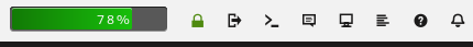
I was wondering this as well. I didn't quite find any way to do that sorting. But then I noticed that while being in the docker tab, there is a small lock at the top that enables the sorting. Not very obvious place to have that setting.
-
The flags will go client side. We are fixing confused client by telling not to trust server and rather keep their own record. Client being whatever connects into SMB server (-> Unraid). Think it as a compatibility mode for server that is doing very weird thinks with file links. Inside the container would sound correct if it works as SMB client. I'm not sure why local container would use SMB access rather than direct mount. This to me suggests that inside the container might not be the correct answer, but rather the Duplicacy client maybe? More knowledge of the Duplicacy setup would be required. Also do consider Unraid just as a Linux server with fancy front controller. The fix would work equally well on any Linux SMB server or TrueNAS etc.
-
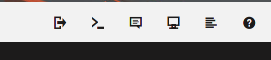
The small icon bar on the navigation menu could do some work. Mainly the ordering. Currently the order is as follows: Logout, Terminal, Feedback, Info, Log, Help. Terminal being so close to logout is bit dangerous, very easy to misclick that. I would suggest new order of: Terminal, Log, Info, Help, Feedback, Logout. Reasoning for this is that terminal and log are likely the most used actions here and them being first "easily available" is important. After that we go to more rarely used section of info, help and feedback. And lastly we have the logout at the end. The logout is at the end so that it is easy to find and it is separated from rest of the things because it is "destructive" action. Meaning that it will instantly log out and you lose whatever you were doing if you were to click that. So it is as far from Terminal as possible. If you were to click terminal, it means you have work to do and last thing you want is to log out. I would even suggest small separators such as: Terminal, Log | Info, Help, Feedback | Logout. But the ordering is most important thing.
-
These are used by fstab in /etc/fstab If you are using some other mounting method then it might be little bit different. Clearly you need to change the IP and sharename etc. Once you have added the config line, you can mount with command: sudo mount -a
-
For SMB at least you don't need to disable hard links nor cache to fix stale file handles. I made a post about it
-
EDIT: As of 2023-02-26 few years active use this solution is confidently stable. Not a single stale and no problems encountered. The Issue and cause When SMB share is mounted to Linux you sometimes might encounter mount hanging and you get error stale file handle. Something in terms of: cannot access '/mnt/sharename': Stale file handle This is caused by file being stored into cache and then moved into another disk by the Mover. The file inode changes and client gets confused because of it. I suspect it could also happen when file moves from another disk inside array, but have not confirmed that and it would be fairly rare issue. Solutions gathered (only one required) Disabling the cache or mover are ways to solve this. However not very practical for many people as it takes away a feature. Disabling hardlinks also fix this problem from occuring. However it also disables hardlinks from whole system. Generally this isn't huge problem. Only certain apps require it and still kind of work with it disabled. Change SMB version to 1.0 at client side. This has some problems as well, such as exposing server to security problems coming with the 1.0 version. It also has some performance problems and lack of features compared to v3. Now for PROPER fix. Key is to add noserverino to mount flags. This forces client to generate its own inode codes rather than using server one. So far I have not noticed any problems by doing this. I can not replicate the issue with this method and I have hardlinks enabled (not required) and SMB v1 disabled (not required). How to replicate the issue Create a file to share that has cache enabled (not prefered). Browse into that directory inside the mount using /mnt/user path Enable the mover Witness the stale file handle error Ramblings Also I found many different variations for the full mount flags and here is what I use: //192.168.1.20/sharename /mnt/sharename cifs rw,_netdev,noserverino,uid=MYLOCALUSERNAME,gid=users,credentials=/etc/samba/credentials/MYLOCALUSERNAME,file_mode=0666,dir_mode=0777 0 0 Let's go thru the mount flags. I'm using these knowing that posix extensions are DISABLED. With them enabled, you might want to use different flags, especially about permissions. Feel free to change them as you like, the noserverino is the ONLY required one. rw - This is just in case and it enabled read/write access to mount. Might be default anyway. _netdev - Makes the system consider this as network device and it actually waits for networking to be enabled before mounting. noserverino - Client generated inodes (required for the fix) uid/gid - These are optional. It makes the mount appear as like its owned by certain uid. Inside the server nothing changes. I'm using these because files are owned by the nobody/users and I can't open files. There is also noperm flag etc. you could use. I just find uid and gid most practical. credentials - This is a file containing username and password for the share. This is just so that people can't see my password by reading /etc/fstab. For more reference how to set this up https://wiki.archlinux.org/index.php/samba#Storing_share_passwords file_mode/dir_mode - These are optional. These make files appear in share as 0666 and 0777 permissions, it does not actually change permissions at server side. Without these the file permissions are not "in sync" and appear wrong in the client side. Such as 0755 directory permissions while it is 0777 in server. Posix/Linux/Unix extensions (not related to stale file handle) Problem I have not been able to solve is how to enable Posix/Linux/Unix extensions. When I try to enable the extensions it errors out saying that server does not support them. Inside samba config in unraid there is unix extensions = No. However turning this Yes in many ways did not enable them. Why this matters? Well those extensions enable certain nice features that makes the share appear as proper linux drive. To confirm that unix extensions are not enabled: mount | grep "//" in the flags you see nounix flag. To enable unix extensions manually add unix to flags. However during mount you get an error and reading dmesg shows you that it reports server not supporting unix extensions. NFS For NFS I still have no real solution other than disabling hardlinks.


