ljm42
Administrators
-
Joined
-
Last visited
Everything posted by ljm42
-
You can try this, but it doesn't catch everything lsof | grep /mnt Your previous diags showed a bash terminal was open, let's see if that is closed. If you run this from a web terminal there should only be one result (the one in use by the web terminal). If there are more then paste the output so we can kill them ps -f | grep "bash" | grep -v "grep"
-
These diags were taken after docker was stopped? Docker is still running. Open a web terminal and run: /etc/rc.d/rc.docker stopIf that doesn't help, try: /etc/rc.d/rc.docker force_stopAlso there was a bash shell open at the time these diags were taken, something as simple as a bash terminal cd'd to the share will block it from unmounting. Be sure to exit all Console/SSH/web terminals
-
Unraid 7.2.0-beta.2 was installed on nearly 4000 systems in the last month! Thanks to everyone who tested and provided feedback. Unraid 7.2.0-beta.3 is now available! See all the details in the release notes (search the page for -beta.3) Note that some plugins may have visual issues in this release, please give plugin authors time to make adjustments. Plugin authors, please see this post describing how to update your plugins to make them responsive. This is BETA software. Please use on test servers only. Upgrade instructions are available in the docs. This announce post is perfect for quick questions or comments, but if you suspect there will be back and forth for your specific issue, please start a new topic in the Prereleases board. Be sure to include your diagnostics.zip.
-
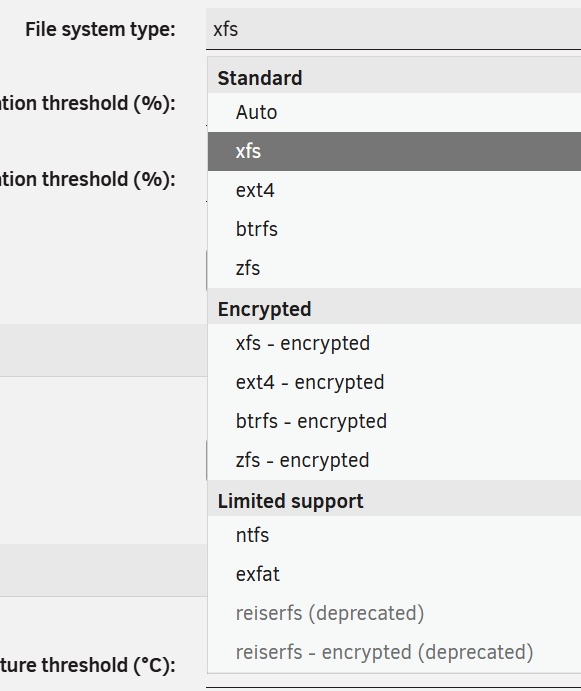
Thanks, in 7.2.0-beta.2 we reorganized dropdown like this:
-
Hi folks, -beta.2 is now available! https://forums.unraid.net/topic/192958-unraid-os-version-720-beta2-available/
-
Unraid 7.2.0-beta.2 is now available! There have been multiple fixes and enhancements since -beta.1, see all the details in the release notes (search the page for -beta.2) Note that some plugins may have visual issues in this release, please give plugin authors time to make adjustments. Plugin authors, please see this post describing how to update your plugins to make them responsive. This is BETA software. Please use on test servers only. This announce post is perfect for quick questions or comments, but if you suspect there will be back and forth for your specific issue, please start a new topic in the Prereleases board. Be sure to include your diagnostics.zip. Upgrade steps for this release Read the release notes As always, prior to upgrading, create a backup of your USB flash device: "Main/Flash/Flash Device Settings" - click "Flash Backup". Update all of your plugins. This is critical for the Connect, NVIDIA and Realtek plugins in particular. If the system is currently running 6.12.0 - 6.12.6, we're going to suggest that you stop the array at this point. If it gets stuck on "Retry unmounting shares", open a web terminal and type: umount /var/lib/dockerThe array should now stop successfully. If you have a recent release or Unraid Connect installed: Open the dropdown in the top-right of the Unraid webgui and click Check for Update, then press More options and switch to the Next branch. You may be prompted to sign in to access the Next branch. Select the appropriate version and choose "View changelog to Start Update". More details in this blog post If you don't have the Check for Update option in the upper right corner: Either install the Unraid Connect plugin or upgrade to 6.12.10 first. Then check for updates as described above. Wait for the update to download and install If you have any plugins that install 3rd party drivers (NVIDIA, Realtek, etc), wait for the notification that the new version of the driver has been downloaded. Reboot This announce post is perfect for quick questions or comments, but if you suspect there will be back and forth for your specific issue, please start a new topic in the Prereleases board. Be sure to include your diagnostics.zip.
-
Flash backup is part of Unraid Connect, the version of Unraid doesn't matter. If the system is backing up regularly, it is because something on the flash drive is changing regularly. The commands I provided above will help you track down which file that is, and from there maybe we can figure out why. If I were to guess, I'd suggest that a plugin is updating something on the flash drive.
-
Flash backup is working as intended. Note this line in the syslog: flash_backup: checking for changes every 1800 seconds If any config file on the flash drive has changed during those 30 minutes, then a backup task will be added. If you want to see which files are being backed up, open a web terminal and run: cd /boot git log --pretty=oneline --name-only BTW, flash backup only looks at the flash drive and is not responsible for spinning up the array.
-
Sure thing! No problem at all
-
A few users reported having issues starting the array after booting into 7.2.0-beta.1: https://forums.unraid.net/bug-reports/prereleases/unable-to-start-array-on-720-beta1-r4001/ https://forums.unraid.net/bug-reports/prereleases/72-rc-1-not-starting-array-each-reboot-i-dont-use-encryption-at-all-r4006/ In their case, the issue appears to be related to old config data for the Unraid API, although so far we have not been successful in identifying the exact details. If you have this issue please: 1. download your diagnostics (from Tools -> Diagnostics) 2. open a web terminal and type: mv /boot/config/plugins/dynamix.my.servers /boot/config/plugins/dynamix.my.servers.bk1 3. reboot the server If that resolved the issue, please add a comment to this thread and include the diagnostics from step 1. Please also mention if you would be willing to DM additional files to @ljm42 or @elibosley , we will reach out if we think it will be helpful. Note: if the above did not help your particular situation, then something else is going on unrelated to this issue. Please start a new thread in prereleases and be sure to upload your diagnostics. Thanks!
-
This announce post is perfect for quick questions or comments, but if you suspect there will be back and forth for your specific issue, please start a new topic under General Support. Be sure to include your diagnostics.zip
-
Many thanks to everyone testing out 7.2.0-beta.1! A couple of highlights: The Tailscale Docker integration is broken in -beta.1 If you use this functionality, we recommend waiting for the next beta. If your array doesn't start, there may be some problematic files in the /boot/config/plugins/dynamix.my.servers/ folder on your flash drive, rename that folder and reboot. If that solves the problem, we are still looking for some examples of the problematic files, so if you could DM them to me or @elibosley that will help us track this down. If you are seeing higher than expected CPU load, take a look at this thread https://forums.unraid.net/bug-reports/prereleases/high-cpu-usage-lsof-720-beta1-r4005/ . It is unclear at this point what the cause is, if you can provide safe mode diagnostics showing the issue that may help us track it down And just a quick reminder... this announce post is perfect for quick questions or comments, but if you suspect there will be back and forth for your specific issue, please start a new topic in the Prereleases board. Be sure to include your diagnostics.zip Thanks again!
-
Do not use jumbo frames, they are nothing but trouble. Fix Common Problems gives this warning: https://forums.unraid.net/topic/120220-fix-common-problems-more-information/page/2/#comment-1167702
-
Yes please! Maybe check here first to see if a bug report exists, if not please feel free to add one: https://forums.unraid.net/bug-reports/prereleases/ Thanks, I see your report here https://forums.unraid.net/bug-reports/prereleases/high-cpu-usage-lsof-720-beta1-r4005/
-
Unraid 7.2.0-beta.1 is now available with a responsive webGUI, built-in Unraid API, RAIDZ expansion, Ext2/3/4 and NTFS support, and the (optional) ability to login to the webgui via SSO, and more! See all the details in the release notes. Note that some plugins may have visual issues in this release, please give plugin authors time to make adjustments. Plugin authors, please see this post describing how to update your plugins to make them responsive. This is BETA software. Please use on test servers only. This announce post is perfect for quick questions or comments, but if you suspect there will be back and forth for your specific issue, please start a new topic in the Prereleases board. Be sure to include your diagnostics.zip. Upgrade steps for this release Read the release notes As always, prior to upgrading, create a backup of your USB flash device: "Main/Flash/Flash Device Settings" - click "Flash Backup". Update all of your plugins. This is critical for the Connect, NVIDIA and Realtek plugins in particular. If the system is currently running 6.12.0 - 6.12.6, we're going to suggest that you stop the array at this point. If it gets stuck on "Retry unmounting shares", open a web terminal and type: umount /var/lib/dockerThe array should now stop successfully. If you have a recent release or Unraid Connect installed: Open the dropdown in the top-right of the Unraid webgui and click Check for Update, then press More options and switch to the Next branch. You may be prompted to sign in to access the Next branch. Select the appropriate version and choose "View changelog to Start Update". More details in this blog post If you don't have the Check for Update option in the upper right corner: Either install the Unraid Connect plugin or upgrade to 6.12.10 first. Then check for updates as described above. Wait for the update to download and install If you have any plugins that install 3rd party drivers (NVIDIA, Realtek, etc), wait for the notification that the new version of the driver has been downloaded. Reboot This announce post is perfect for quick questions or comments, but if you suspect there will be back and forth for your specific issue, please start a new topic in the Prereleases board. Be sure to include your diagnostics.zip.
-
This post is similar to our announce post formats, great for quick questions or comments but not ideal for a lot of back and forth. We are trying something new for bug reports related to plugin development and the responsive webGUI changes: Submit a bug report (related to plugin development and the responsive webGUI) View existing bug reports (related to plugin development and the responsive webGUI)
-
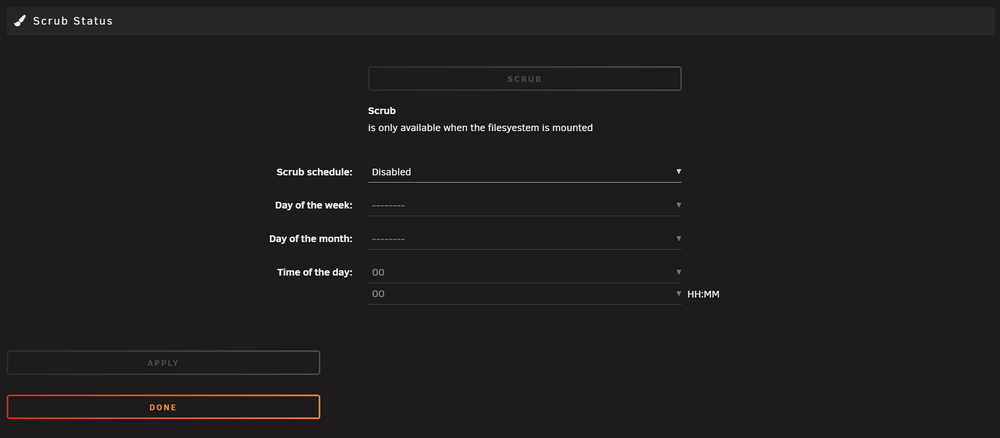
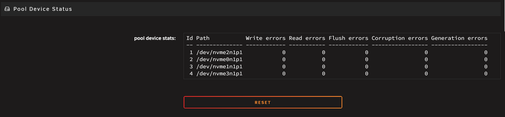
Table of ContentsWhy Responsive? The Benefits for Unraid Users & Developers Important: DOM Structure Changes Dashboard Tile Structure Changes Prerequisite: How .page Files Are Parsed Common Bugs in .page Files Making Wide Tables Responsive CSS Color Variables Footer Plugin Integration Summary Last Resort: Opting Out of Responsive Layout Why Responsive? The Benefits for Unraid Users & DevelopersIn Unraid 7.2, the webGUI has been refactored to support responsive CSS. Here's why this matters: Mobile & Tablet Friendly: Manage your server from any device, any screen size, no more pinching/zooming required. Consistent Layouts: No more broken forms or tables on small screens. Everything adapts. Modern Look & Feel: Cleaner, more professional UI that matches user expectations. Important: DOM Structure Changes⚠️ Critical Information for Plugin Developers The default DOM structure has changed significantly with the responsive update. Previous hacks and customizations that manipulated the DOM may no longer work correctly or may cause undesirable display aberrations. Key Changes That Affect PluginsTitle Bar Modifications No Longer Supported Adding buttons, sliders, or other elements to title bars will either not appear or display with odd spacing and will have definite display issues on mobile devices Going forward, do not add any elements into title bars Plugin Functionality Remains IntactImportant reassurance for plugin authors: Even if display aberrations appear due to DOM changes, there should be no issues with the actual plugin functionality itself. The responsive changes are purely visual/layout related. Dashboard Tile Structure Changes⚠️ Important for plugins that add custom dashboard tiles The Dashboard (DashStats) component has undergone significant structural changes to support responsive layouts and improved mobile experience. Old Dashboard Tile StructurePreviously, dashboard tiles used a flat structure with inline control elements: <tbody> <tr> <td> <i class='icon-performance f32'></i> <div class='section'>Title<br>Subtitle<br></div> <a href='...'><i class='fa fa-cog control'></i></a> <span class='ctrl'> <!-- Control buttons directly in ctrl span --> </span> </td> </tr> <tr> <td> <!-- tile content --> </td> </tr> </tbody> New Dashboard Tile StructureThe new structure introduces a flexbox-based tile header system: <tbody> <tr> <td> <span class='tile-header'> <span class='tile-header-left'> <i class='icon-performance f32'></i> <div class='section'> <h3 class='tile-header-main'>Title</h3> <span>Subtitle</span> </div> </span> <span class='tile-header-right'> <span class='tile-ctrl'> <!-- Primary control buttons --> </span> <span class='tile-header-right-controls'> <!-- Secondary control links --> </span> </span> </span> </td> </tr> <tr> <td> <!-- tile content --> </td> </tr> </tbody> For plugins that require backwards compatibility with the old dashboard tile structure, you can use the following code. This conditional rendering will ensure that the tile header is consistent across all versions of the webgui. // check if the current version of the webgui is 7.2.0-beta or higher <? $isResponsiveWebgui = version_compare(parse_ini_file('/etc/unraid-version')['version'],'7.2.0-beta','>='); ?> <tbody title='My Tile'> <tr> <td> <span class='tile-header'> <span class='tile-header-left'> <i class='icon-performance f32'></i> <div class='section'> <? if ($isResponsiveWebgui): ?> <!-- if the current version of the webgui is 7.2.0-beta or higher show the new tile header structure --> <h3 class='tile-header-main'>Title</h3> <span>Subtitle</span> <? else: ?> <!-- if the current version of the webgui is less than 7.2.0-beta show the old tile header structure --> Title<br> <span>Subtitle</span><br> <? endif; ?> </div> </span> <span class='tile-header-right'> <span class='tile-ctrl'> <!-- Primary control buttons --> </span> <span class='tile-header-right-controls'> <!-- Secondary control links --> </span> </span> </span> </td> </tr> <tr> <td> my tile content </td> </tr> </tbody>Dashboard CSS Class ChangesRemoved/Modified Classes.ctrl → Now use .tile-ctrl within .tile-header-right span.ctrl float and margin properties removed Several hardcoded widths removed for responsive design Grid gap changed from 20px to 2rem for consistency New Dashboard CSS Classes.tile-header { display: flex; flex-direction: row; justify-content: space-between; align-items: start; gap: 1rem; } .tile-header-left { display: flex; flex-direction: row; flex-wrap: wrap; align-items: start; justify-content: flex-start; gap: 1rem; } .tile-header-right { display: flex; flex-direction: row; flex-wrap: wrap-reverse; flex-shrink: 0; align-items: start; justify-content: flex-end; gap: 1rem; } .tile-header-right-controls { display: inline-flex; flex-direction: row; flex-wrap: wrap; align-items: center; justify-content: flex-end; gap: .5rem; } .tile-header-right-controls a { display: inline-flex; } .tile-ctrl span { font-size: 2rem !important; } Dashboard Responsive Grid SystemThe dashboard now uses CSS Grid with responsive breakpoints: div.grid { display: grid; grid-template-columns: 1fr; /* 1 column by default (mobile) */ gap: 2rem; } @media (min-width: 768px) { div.grid { grid-template-columns: repeat(2, 1fr); /* 2 columns for tablets */ } } @media (min-width: 1600px) { div.grid { grid-template-columns: repeat(3, 1fr); /* 3 columns for desktop */ } } System Memory Tile Responsive ClassesFor tiles displaying system memory information: .tile-system-memory-body { display: grid; grid-template-columns: 1fr; gap: 1rem; } @media (min-width: 768px) { .tile-system-memory-body { grid-template-columns: repeat(2, 1fr); } } .tile-system-memory-charts { display: grid; grid-template-columns: repeat(2, 1fr); gap: 1rem; } @media (min-width: 450px) { .tile-system-memory-charts { grid-template-columns: repeat(4, 1fr); } } Case Selection Modal UpdatesInteractive styles for case selection have been enhanced: .tile-select-case { cursor: pointer; transition: color 0.2s ease, opacity 0.2s ease; } .tile-select-case:hover { color: var(--orange-800); } .tile-select-case:has(img) { opacity: 1; } .tile-select-case:has(img):hover { opacity: .75; } Dashboard Theme VariablesCustom properties for dashboard theme compatibility: :root { --dashstats-pie-after-bg-color: #262626; --dashstats-medium-breakpoint: 768px; --dashstats-large-breakpoint: 1600px; } .Theme--gray:root { --dashstats-pie-after-bg-color: #3d3c3a; } .Theme--azure:root { --dashstats-pie-after-bg-color: #dcdcdc; } .Theme--white:root { --dashstats-pie-after-bg-color: #f7f9f9; } Migrating Custom Dashboard TilesStep 1: Update HTML StructureBefore: <tr> <td> <i class='icon-custom f32'></i> <div class='section'>My Custom Tile<br></div> <a href='/settings'><i class='fa fa-cog control'></i></a> <span class='ctrl'> <span class='fa fa-power-off hand' onclick='action()'></span> </span> </td> </tr>After: <tr> <td> <span class='tile-header'> <span class='tile-header-left'> <i class='icon-custom f32'></i> <div class='section'>My Custom Tile<br></div> </span> <span class='tile-header-right'> <span class='tile-ctrl'> <span class='fa fa-power-off hand' onclick='action()'></span> </span> <span class='tile-header-right-controls'> <a href='/settings'> <i class='fa fa-cog control'></i> </a> </span> </span> </span> </td> </tr>Step 2: Update CSS SelectorsReplace .ctrl with .tile-ctrl Remove any custom float or fixed width styles Use flexbox properties instead of floats for alignment Step 3: Add Theme SupportFor custom themes, add the dashboard-specific variables: .Theme--[your-theme]:root { --dashstats-pie-after-bg-color: [your-color]; }Step 4: Test Responsive BehaviorVerify your dashboard tiles work at: Mobile: < 768px (single column) Tablet: 768px - 1599px (two columns) Desktop: ≥ 1600px (three columns) Important Dashboard Changes to NoteDuplicate User Information Tile Removed: The second user information tile has been completely removed to reduce redundancy Fixed Widths Removed: Many hardcoded width values have been removed for better responsiveness Control Organization: Controls are now separated into primary (tile-ctrl) and secondary (tile-header-right-controls) groups Gap Spacing: Consistent use of rem units (.5rem for controls, 1rem for main sections) Prerequisite: How .page Files Are Parsed (Markdown, Whitespace, and Structure)Unraid's plugin system uses .page files, which are parsed using a custom Markdown engine. Understanding this is key to writing responsive plugins. The Parsing PipelineHeader Parsing: The top of the file (before ---) is parsed as INI for metadata (Title, Menu, etc). Content Parsing: The rest is parsed as Markdown, with special handling for translation (_(text)_) and definition lists. PHP Evaluation: Any PHP code is executed after Markdown is processed. Whitespace & Markdown StructureDefinition List Syntax: _(Label)_: : <input ...>This is parsed into: <dl> <dt>Label</dt> <dd><input ...></dd> </dl>Whitespace is Critical: The colon (:) must be at the start of the line, followed by a space. Indentation or extra spaces can break parsing, causing elements to fall outside the <dl> structure. Final Render: The browser receives a series of <dl>, <dt>, and <dd> elements, which are then styled by CSS. Responsive CSS expects this structure to apply correct flex/grid layouts. Block Tags and Markdown ParsingBy default, if you use a <div> (or any block-level HTML tag) in your .page file, the contents inside that tag will NOT be parsed as markdown. The markdown parser treats the contents as raw HTML and leaves them untouched. If you want the contents of a <div> (or other block tag) to be parsed as markdown, you must add markdown="1" to the tag: <div> _(This will NOT be parsed as markdown)_ : <input type="text"> </div>With markdown="1": <div markdown="1"> _(This WILL be parsed as markdown inside the div)_ : <input type="text"> </div>Example 2 With markdown="1": _(This WILL be parsed as markdown)_ : <div markdown="1"> _(This WILL be parsed as markdown inside the div)_ <input type="text"> <div class="my-custom-element"> <p>This will not be parsed as markdown.</p> <p><?= "This is php shorthand echo without markdown parsing"; ?></p> <p><?= _("This is php shorthand echo with translation support and no markdown parsing"); ?></p> </div> </div>This applies to all block-level tags (div, section, article, etc). Use markdown="1" if you need markdown parsing inside a custom container. Why This MattersIf your markup doesn't follow the expected pattern, the CSS can't do its job. That's when you get broken layouts, giant buttons, or misaligned fields. Common Bugs in .page Files (and How to Fix Them)1. Large ButtonsBug: Buttons stretch full width, look massive, or break the layout. This is the most common cause of display issues in migrated plugins. Pool Device Status page before fix: The Reset button is stretched and not visually grouped. Why: On desktop screens, <dd> uses display: flex; flex-direction: column;(see the responsive CSS). This means every direct child of <dd>—including buttons, inputs, spans, etc.—is stacked vertically and stretched to the available width by default. If you put a button directly inside <dd>, it becomes a flex item and will stretch to fill the column (unless it's inside a <span> or similar inline container). Old markup: _(Action)_: : <input type="button" value="Click Me 1"> : <input type="button" value="Click Me 2"> <!-- WRONG: likely to break parsing + responsive layout -->Fix: Wrap buttons in a <span> (or <span class="buttons-spaced"> for groups): _(Action)_: : <span><input type="button" value="Click Me 1"></span> : <span><input type="button" value="Click Me 2"></span> <!-- or use a button group, explained below -->For button groups: Before: : <input type="submit" name="#apply" value="_(Apply)_"><input type="button" value="_(Done)_" onclick="done()">After: : <span class="buttons-spaced"> <input type="submit" value="Apply"> <input type="button" value="Done"> </span>Backwards Compatibility: The <span> wrapper fix is fully backwards compatible with older Unraid versions and will not cause any display issues on systems that haven't updated to the responsive layout. 2. Settings Label + Inputs Are Offset (Whitespace/Parsing Issue)Bug: Labels and inputs don't line up, or inputs appear on a new line, not next to their label. Scrub Status page before fix: Labels and controls are misaligned due to whitespace/structure issues. Why: Extra spaces, tabs, or missing colons in the Markdown definition list syntax. Elements placed outside the label: content pattern aren't wrapped in <dl>, <dt>, <dd>. Or potentially two <dd> elements adjacent to each other. Fix: Make sure every input is inside a definition list and with a line break between each label + content pair: _(Setting One)_: : <input type="text" ...> _(Setting Two)_: : <input type="text" ...> _(Setting Three)_: : <input type="text" ...>For elements with no label, use as the label: : <span class="buttons-spaced">...</span>Inspect the page source and clean up whitespace in an attempt to remove rogue elements outside the definition structure. Making Wide Tables Responsive: Using the TableContainer ClassWhen you have tables with a lot of columns (wide tables) in your plugin, you should wrap them in a special container to ensure they remain usable on all screen sizes. The TableContainer class sets a minimum width on the table, so it doesn't shrink too small on mobile or narrow windows. This allows users to scroll horizontally to view the entire table, especially when there are many columns. How to UseFor tables with many columns (wide tables), wrap them in a <div class="TableContainer">. For simple/narrow tables, this wrapper is usually not needed. Test extensively at various screen sizes and make your decision based on your own content display needs. Why?Without this wrapper, wide tables may become too small to read or interact with at smaller screen sizes. The TableContainer class sets a min-width on the table and enables horizontal scrolling, so users can always access all columns, even on mobile. Example: Before<table> <thead> <tr><th>Col1</th><th>Col2</th><th>Col3</th>...<th>ColN</th></tr> </thead> <tbody> <tr><td>...</td><td>...</td><td>...</td>...<td>...</td></tr> </tbody> </table>Example: After<div class="TableContainer"> <table> <thead> <tr><th>Col1</th><th>Col2</th><th>Col3</th>...<th>ColN</th></tr> </thead> <tbody> <tr><td>...</td><td>...</td><td>...</td>...<td>...</td></tr> </tbody> </table> </div>Tip: Only wrap the immediate table element—don't nest TableContainers or wrap unrelated content. CSS Color Variables for Theme CompatibilityUsing CSS Variables for Better Theme SupportWhen developing plugins that specify custom colors in CSS, it's recommended to use CSS variables with fallbacks to ensure compatibility across different themes and Unraid versions. Best PracticeInstead of hardcoding colors, use the OS color variables with fallbacks: /* Recommended approach */ color: var(--orange-500, #FF8C2F); background-color: var(--blue-600, #1E40AF); border-color: var(--gray-300, #D1D5DB);Why This MattersTheme Compatibility: Your plugin will automatically adapt to different themes Future-Proofing: Works with upcoming theme updates Backwards Compatibility: The fallback color ensures compatibility with older Unraid versions that don't support the CSS variables User Experience: Colors will be consistent with the rest of the system Available VariablesCommon color variables include: --orange-500, --orange-600, etc. --blue-500, --blue-600, etc. --gray-100, --gray-200, --gray-300, etc. --red-500, --green-500, etc. Consult the current Unraid CSS documentation for the complete list of available color variables. Footer Plugin IntegrationOverviewThe footer has been redesigned with responsive capabilities and horizontal scrolling support. Plugin developers need to understand the new footer structure to properly integrate their content. Footer StructureThe footer contains two main sections: .footer-left - Contains system status and notifications (left side on desktop, top on mobile) .footer-right - Contains copyright, links, and plugin-added content (right side on desktop, bottom on mobile) Adding Content to the FooterAll plugin content should be added to the .footer-right element. Note on Backwards Compatibility: The element also retains id="copyright" for potential backwards compatibility with existing plugins, but new development should use the .footer-right class selector as the preferred method for DOM injection. JavaScript Integration// Preferred method: Use the class selector $('.footer-right').append('<span>Your plugin content</span>'); // Legacy method (for backwards compatibility only) $('#copyright').append('<span>Your plugin content</span>');Important ConsiderationsNo Line Breaks: Content added to .footer-right will never break to a new line Horizontal Scrolling: When content overflows, the footer will automatically enable horizontal scrolling Responsive Behavior: Mobile: Footer stacks vertically (.footer-left on top, .footer-right below) Desktop: Footer displays side-by-side (.footer-left on left, .footer-right on right) Content Styling: Added elements should use white-space: nowrap if they contain text that shouldn't wrap Example// Good: Add a status indicator $('.footer-right').append('<span class="plugin-status">Plugin: Active</span>'); // Good: Add a clickable element $('.footer-right').append('<span onclick="openPluginSettings()"> Settings</span>'); // Good: Add multiple related elements $('.footer-right').append(` <span class="plugin-info"> <span>Version: 1.0</span> <span>Status: OK</span> </span> `);CSS ConsiderationsThe footer uses flexbox layout with the following key properties: flex-wrap: nowrap - Prevents content from wrapping to new lines overflow-x: auto - Enables horizontal scrolling when needed gap: 1rem - Provides consistent spacing between elements Your plugin content will automatically inherit these behaviors when added to .footer-right. SummaryWrap button groups in <span class="buttons-spaced"> (backwards compatible). Watch your whitespace and colons—Markdown parsing is strict. Test on mobile and desktop to catch layout issues early. Add footer content to .footer-right element for proper responsive behavior. Use CSS color variables with fallbacks for better theme compatibility. Avoid manipulating title bars or other DOM elements that have changed structure. Update custom dashboard tiles to use the new flexbox-based tile-header structure. Replace .ctrl with .tile-ctrl for dashboard control elements. Test dashboard tiles at all responsive breakpoints (mobile, tablet, desktop). Last Resort: Opting Out of Responsive Layout (When No Other Option Exists)⚠️ IMPORTANT: This should only be used as a last resort when no other solution exists for severe display issues. What This Does (and Doesn't Do): Only sets a minimum width of 1200px on your page content Does NOT fix other display issues caused by DOM structure changes Does NOT address title bar manipulation problems Does NOT solve button sizing or layout alignment issues Most plugin display issues will NOT be resolved by disabling responsive layout. You should address the root causes outlined in this guide instead. When to Use This OptionThis option should ONLY be considered when: You have complex custom layouts that cannot be adapted to the responsive system You have exhausted all other solutions in this guide The display issues are severe enough to make your plugin unusable You have a legitimate technical constraint that prevents proper responsive implementation When NOT to Use This OptionDo NOT use this option: Simply because you don't want to spend time on responsive design For basic button sizing issues (use <span> wrappers instead) For alignment problems (fix your markdown structure instead) For plugins that add buttons to every page or modify global behavior For .page files that execute code on every page or add global elements Important RestrictionsGlobal Pages and Utilities: If your .page file adds buttons to run code on every page, modifies the footer globally, or affects system-wide behavior, it should NEVER include ResponsiveLayout="false". Adding this to global utilities could disable responsive behavior across the entire OS. Implementation OptionsThere are two approaches to opting out: Option 1: Full Page Opt-Out (Custom pages without markdown parsing)Add the following to the YAML header of your .page file: Add the following to the top (YAML header) of your .page file: Title="Your Plugin" Tag="clipboard" Markdown="false" ResponsiveLayout="false" ---Example: Title="Add VM" Tag="clipboard" Cond="(pgrep('libvirtd')!==false)" Markdown="false" ResponsiveLayout="false" ---See AddVM.page and UpdateVM.page for real-world examples of this approach. Instead of using the dl > dt + dd structure, these pages use a different layout system that doesn't utilize markdown parsing. What This Does Wraps your page content in a <div class="content--non-responsive"> that forces a minimum width of 1200px via CSS. This keeps your layout looking like the old (non-responsive) UI, even on smaller screens. Your page content will not adapt to mobile or small window sizes—it will always be at least 1200px wide, and users may need to scroll horizontally on small devices. This is a stopgap. You should still plan to migrate to the responsive system for the best user experience and future compatibility. Option 2: Selective Element Opt-OutFor pages that mix standard responsive elements with custom complex layouts, wrap only the problematic elements: (Standard Setting): : <input type="text" ...> <div class="content--non-responsive"> <div class="complex-custom-layout"> <!-- Your complex layout that can't be made responsive --> </div> </div> (Another Standard Setting): : <input type="number" ...>This allows standard form elements to remain responsive while protecting specific complex components. Option 3: Wrap your custom elements in a <div class="content--non-responsive"> to force a min width of 1200pxLet's say you have a *.page for your plugin. It has some settings that follow the standard label: content pattern that are get parsed into a <dl>, <dt>, <dd> structure. But also on this page you have custom element(s) that are not parsed by the markdown parser and wrapped in the dl > dt + dd structure. Instead you maybe have a <div> that contains your plugin specific content. And instead that plugin specific content you have a complex layout. Before example: _(Setting One)_: : <input type="text" ...> <div class="plugin-element-one"> <header> <h2>Plugin Element</h2> </header> <div> <p>This is a plugin element</p> </div> </div> _(Setting Two)_: : <input type="number" ...> <div class="plugin-element-two"> <header> <h2>Plugin Element</h2> </header> <div> <p>This is a plugin element</p> </div> </div>After example: _(Setting One)_: : <input type="text" ...> <!-- option 1 --> <div class="content--non-responsive"> <div class="plugin-element-one"> ... </div> </div> <!-- option 2 --> <div class="plugin-element-one content--non-responsive"> ... </div> _(Setting Two)_: : <input type="number" ...> <!-- option 1 --> <div class="content--non-responsive"> <div class="plugin-element-one"> ... </div> </div> <!-- option 2 --> <div class="plugin-element-one content--non-responsive"> ... </div> The route you choose will depend on your specific use case. Explore the available options. If these specific examples don't apply to your plugin, you can still opt out of the responsive layout by adding ResponsiveLayout="false" to the top (YAML header) of your .page file. Or come up with your own solution for your specific use case. However, we highly recommend you migrate to the responsive system for the best user experience and future compatibility. Final ReminderThis is not a substitute for proper responsive design. Users on mobile devices will have a poor experience with non-responsive content. Consider this a temporary measure while you work toward a proper responsive implementation.
-
Hi folks, if your configuration was having networking issues in 7.1.3, please upgrade to 7.1.4 https://forums.unraid.net/topic/191287-unraid-os-version-714-available/
-
This is a bugfix release mainly focused on networking issues, please see the release notes for all the details. This announce post is perfect for quick questions or comments, but if you suspect there will be back and forth for your specific issue, please start a new topic under General Support. Be sure to include your diagnostics.zip. Upgrade steps for this release As always, prior to upgrading, create a backup of your USB flash device: "Main/Flash/Flash Device Settings" - click "Flash Backup". Read the release notes. Update all of your plugins. This is critical for the Connect, NVIDIA and Realtek plugins in particular. If the system is currently running 6.12.0 - 6.12.6, we're going to suggest that you stop the array at this point. If it gets stuck on "Retry unmounting shares", open a web terminal and type: umount /var/lib/dockerThe array should now stop successfully If you have a recent release or Unraid Connect installed Open the dropdown in the top-right of the Unraid webgui and click Check for Update. More details in this blog post If you are on an earlier version Go to Tools -> Update OS and switch to the "Stable" branch if needed. If the update doesn't show, click "Check for Updates" Wait for the update to download and install If you have any plugins that install 3rd party drivers (NVIDIA, Realtek, etc), wait for the notification that the new version of the driver has been downloaded. Reboot This announce post is perfect for quick questions or comments, but if you suspect there will be back and forth for your specific issue, please start a new topic under General Support. Be sure to include your diagnostics.zip.
-
This is a bugfix release mainly focused on networking issues, we'd like feedback before releasing it as 7.1.4. Details in the release notes. This announce post is perfect for quick questions or comments, but if you suspect there will be back and forth for your specific issue, please start a new topic in the Prereleases board. Be sure to include your diagnostics.zip. Upgrade steps for this release Read the release notes As always, prior to upgrading, create a backup of your USB flash device: "Main/Flash/Flash Device Settings" - click "Flash Backup". Update all of your plugins. This is critical for the Connect, NVIDIA and Realtek plugins in particular. If the system is currently running 6.12.0 - 6.12.6, we're going to suggest that you stop the array at this point. If it gets stuck on "Retry unmounting shares", open a web terminal and type: umount /var/lib/dockerThe array should now stop successfully. If you have a recent release or Unraid Connect installed: Open the dropdown in the top-right of the Unraid webgui and click Check for Update, then press More options and switch to the Next branch. You may be prompted to sign in to access the Next branch. Select the appropriate version and choose "View changelog to Start Update". More details in this blog post If you don't have the Check for Update option in the upper right corner: Either install the Unraid Connect plugin or upgrade to 6.12.10 first. Then check for updates as described above. Wait for the update to download and install If you have any plugins that install 3rd party drivers (NVIDIA, Realtek, etc), wait for the notification that the new version of the driver has been downloaded. Reboot This announce post is perfect for quick questions or comments, but if you suspect there will be back and forth for your specific issue, please start a new topic in the Prereleases board. Be sure to include your diagnostics.zip.
-
I updated the release notes to clarify that this resolves issues with host access to custom networks. Also rewrote the line about mover as that was causing unnecessary concern.
-
This is a small bugfix and security update release, please see the release notes for all the details. This announce post is perfect for quick questions or comments, but if you suspect there will be back and forth for your specific issue, please start a new topic under General Support. Be sure to include your diagnostics.zip. Upgrade steps for this release As always, prior to upgrading, create a backup of your USB flash device: "Main/Flash/Flash Device Settings" - click "Flash Backup". Read the release notes. Update all of your plugins. This is critical for the Connect, NVIDIA and Realtek plugins in particular. If the system is currently running 6.12.0 - 6.12.6, we're going to suggest that you stop the array at this point. If it gets stuck on "Retry unmounting shares", open a web terminal and type: umount /var/lib/dockerThe array should now stop successfully If you have a recent release or Unraid Connect installed Open the dropdown in the top-right of the Unraid webgui and click Check for Update. More details in this blog post If you are on an earlier version Go to Tools -> Update OS and switch to the "Stable" branch if needed. If the update doesn't show, click "Check for Updates" Wait for the update to download and install If you have any plugins that install 3rd party drivers (NVIDIA, Realtek, etc), wait for the notification that the new version of the driver has been downloaded. Reboot This announce post is perfect for quick questions or comments, but if you suspect there will be back and forth for your specific issue, please start a new topic under General Support. Be sure to include your diagnostics.zip.
-
Thanks @EDACerton for forking these plugins when they were removed, and I believe you have some enhancements planned too, which is cool. Thanks for going ahead and removing the telemetry, this is something we were aware of but didn't have good policies for. Although I think you were doing it well and with user privacy in mind, I expect we'll work on a policy for that and ultimately provide a more global solution for optionally reporting telemetry from plugins.
-
This is a small but important release, resolving a potential data-loss issue in 7.1.0 and 7.1.1 where the recent "mover empty disk" feature does not handle split levels on shares correctly. Please see the release notes for all the details. This announce post is perfect for quick questions or comments, but if you suspect there will be back and forth for your specific issue, please start a new topic under General Support. Be sure to include your diagnostics.zip. Upgrade steps for this release As always, prior to upgrading, create a backup of your USB flash device: "Main/Flash/Flash Device Settings" - click "Flash Backup". Read the release notes. Update all of your plugins. This is critical for the Connect, NVIDIA and Realtek plugins in particular. If the system is currently running 6.12.0 - 6.12.6, we're going to suggest that you stop the array at this point. If it gets stuck on "Retry unmounting shares", open a web terminal and type: umount /var/lib/docker The array should now stop successfully If you have a recent release or Unraid Connect installed Open the dropdown in the top-right of the Unraid webgui and click Check for Update. More details in this blog post If you are on an earlier version Go to Tools -> Update OS and switch to the "Stable" branch if needed. If the update doesn't show, click "Check for Updates" Wait for the update to download and install If you have any plugins that install 3rd party drivers (NVIDIA, Realtek, etc), wait for the notification that the new version of the driver has been downloaded. Reboot This announce post is perfect for quick questions or comments, but if you suspect there will be back and forth for your specific issue, please start a new topic under General Support. Be sure to include your diagnostics.zip.
-
Try this https://docs.unraid.net/unraid-os/release-notes/7.0.0/#excessive-flash-drive-activity-slows-the-system-down