Hammy Havoc
Members
-
Joined
-
Last visited
Everything posted by Hammy Havoc
-
Having them overlap stuff is a real annoyance when there's plenty of wasted space in the UI. Would make even more sense if the manual was just an icon in the row of black icons next to the help button in the floating header menu next to the help button.
-
Still having it as a clickable button when it won't do anything at the bottom of a page is just confusing. The odd thing is that it works just fine for the Back to Top button in terms of hiding it.

-
The Array Operations on Main is very cluttered and intimidating for newbies. The "helpful" explanations next to the buttons aren't actually helpful to parse, and for seasoned users, it's like constantly having training wheels attached to your administrative GUI. Proposing the following: Reducing explainer text in favor of better buttons. Split the footer of Main into vertical columns. E.g., a Parity column with all relevant info and buttons grouped together Started being changed to Array Started as its proximity to Parity is valid can falsely imply association to parity checks. STOP being changed to STOP ARRAY CHECK being change to CHECK PARITY Conditional logic to hide CHECK/CHECK PARITY if a user has not configured parity drives; real possibility with some people going all-in on ZFS pools for their containers Conditional logic to hide or grey out SPIN UP or SPIN DOWN based on whether or not the drives are all currently spinning or stopped Move REBOOT and SHUTDOWN to the header menu ala Dynamix System Buttons, because server power has absolutely nothing to do "Array Operations" as a concept, so having them clustered here at the bottom of all your disks and pools (???) and not available on every page makes no sense to me and never has, other than as a remnant of an earlier and much more simple time before Unraid did so many things in the OOBE. Potential big changes as an alternative to some of the above: Drop the Started and green ball next to it entirely as it's redundant as the user always has Array Started visible in the footer of every page in the bottom left of the GUI. Move the version number beneath the Unraid logo to the bottom right of the floating footer Move the Unraid OS edition (e.g., Pro) to the bottom right of the floating footer on every page Add the SPIN UP % and SPIN DOWN % icon from Main next to the Array Started in the floating footer of every page Move the MOVE button next to the Array Started in the floating footer of every page. Move the manual as just a hyperlinked icon to the row of black icons in the floating header of every page, next to the Help icon
-
Perhaps also linking from the element to either documentation for more info or where in the UI they can set it up might be good for revealing functionality users might not know about. However, if I'm not using it, and I know that's not going to be changing any time soon, I'd rather a toggle for conditional logic to hide it.
-
This should absolutely be a feature in the OOBE. Being able to remotely restart or shut down your server is a no-brainer. Imagine: you've got a UPS hooked up (feature in the Unraid OOBE), you get a notification that the server is now operating on battery power, you want to shut it down right now, but you need to futz around with installing a plugin to add power commands to the GUI. Absolutely should be there.
-
Might also be nice to give users a notification that there's unresolved errors, or errors that they've not yet seen (even better).
-
Bit of feedback: it's always confused new users that Apps in the header bar doesn't take them to their own services or plugins, and is in fact more of an "app store" style repository of plugins and container templates. IMO, it would make sense to move this to the row of black icons on the right of the header. Perhaps an icon that says "apps and icons". Something along the lines of https://www.flaticon.com/free-icon/application_5997060?term=apps&page=1&position=13&origin=search&related_id=5997060 could work (extremely open in that regard). I also feel like the Docker page should have a split button akin to Gmail's Send/Schedule split button, so that users can quickly choose to add a container from the Community Apps plugin. Likewise, I think it would be intuitive to tie Community Apps into /Docker/AddContainer by letting users search for a container template beyond their own local ones within that UI. Clicking the Browse Community Apps Templates could open a side-bar on the right that lets users scroll and search through templates, then dynamically load the template in on the left, so they can check the vars, and if it doesn't meet expectations or requirements, continue browsing uninterrupted to see what other templates offer. This would be hugely valuable when there are sometimes a lot of options for a single piece of software, e.g., Nextcloud has AIO etc. Would also be nice to pull in templates and compose files from other registries.
-
Quickly getting to things like User Scripts would be great. Goes hand-in-hand with these changes: https://forums.unraid.net/topic/190852-combine-tools-and-settings-into-tools-settings-or-just-settings-with-more-sections/ https://forums.unraid.net/topic/190853-move-user-utilities-from-settings-into-plugins/
-
Where you would reasonably expect to be able to find them and ties in with https://forums.unraid.net/topic/190852-combine-tools-and-settings-into-tools-settings-or-just-settings-with-more-sections/
-
This change would go hand-in-hand with putting User Utilities from Settings into Plugins, which is where you would reasonably expect to be able to find them.
-
Not being able to continue queuing file operations even beyond the current top-level dir or share doesn't make much sense to me. "But the files might have changed by the time the job runs", so checksum when the job is requested and checksum when its turn in the queue comes, and if something has changed, ask the user to Approve or Deny running the job following those changes.
-
It is absolutely bizarre to me that the most important tool for monitoring an Unraid server whilst using it isn't constantly visible to the user. It absolutely needs to be in the row of icons below.
-
It makes no sense to have the server name this large. Makes far more sense to put it on the line above at the same font size as the uptime. Think about it: I can see what server I'm signed into already from the URL bar. Why does the server name need to be so enormous?
-
It makes absolutely no sense being there in what should probably be a user account-centric area of the GUI. The Unraid version number is directly opposite on the left beneath the logo. If it should be anywhere, it should be there, and the release notes should load as a modal pop-under instead of a hyperlink outside the admin GUI, and within that, should allow you to also check for updates and see "What's New" in terms of any pending updates with a changelog.
-
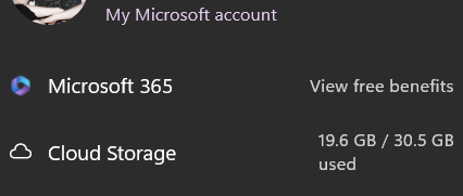
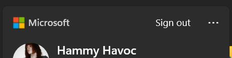
This is following on from https://forums.unraid.net/topic/190845-move-the-logout-icon-in-the-header-to-the-right-most-position/ and https://forums.unraid.net/topic/190846-move-sign-out-of-unraidnet-into-settings-for-unraid-connect/ : The hamburger menu in the header is very odd in its placement and that it's for Unraid Connect is baffling as a design choice. The circular avatar next to it should actually be rolled into Unraid OS itself, and the name of the current user should be displayed next to it. When clicking it, you should get a drop-down menu, as is pretty standard on most UIs with social media, apps et al. Unraid Connect as a plugin should instead append functionality to the menu, if appropriate. However, I would argue that a Sign out of Unraid.net menu option is absolutely redundant and it's odd to have been implemented there in the first place and not in Settings in the Unraid OS section. Microsoft and Apple don't have Sign out of OneDrive in the Windows Start menu, but they do have OneDrive info (though I wish it could be toggled as I use Nextcloud for everything):
-
It makes absolutely zero sense why it's in the header constantly. How many people are signing out of Unraid Connect regularly enough once set up that they need it in their header?
-
I click the Logout icon many times a week because it's directly next to the Terminal icon and both feature right-pointing arrows in their design. It's honestly one of the biggest causes of annoyance for me. In terms of common functions, I'm more likely to want to use Terminal than I am to Logout. Though perhaps allowing the user to re-order them might also be a good idea (but how many people would seriously want Logout next to Search and Terminal?). The lack of a confirmation dialogue is also equally irritating. Are you sure you want to log out? would be great too. At the same time though, the Unraid Connect plugin's circular avatar should display the user info for Unraid OS itself, and the Logout feature should be in there, like most modern-day UX. The Unraid Connect plugin should append functionality to that. I also don't see why Sign out of Unraid.net is even an option within the header for Unraid Connect and not in Settings, but that's a piece of feedback for another post.
-
Makes no sense having it under the logo, IMO. "What edition and version of Unraid are you on?" and your eyes go to the top right where Unraid OS Pro or similar is, and then scan back to beneath the logo. Though perhaps what might make more sense is instead ditching the upper right edition text and instead adding a badge or text to the Unraid logo on the left of the header. Could be a small badge similar to HD badge overlays on various stores or streaming platforms when things being HD was still new and novel.
-
Small bit of feedback: I would personally have the icon in the header follow the colour scheme of the other icons. The red is too "error"/"attention required", especially with the Unraid notification bell icon applying colour codes on top of the bell to indicate status. It doesn't follow the current design language, IMO.
-
Does a config option exist for collapsing the list of Historical Unassigned Devices? I don't need it visible 99% of the time, and don't even need it populating until it's expanded, but I do value the information in it when required.
-
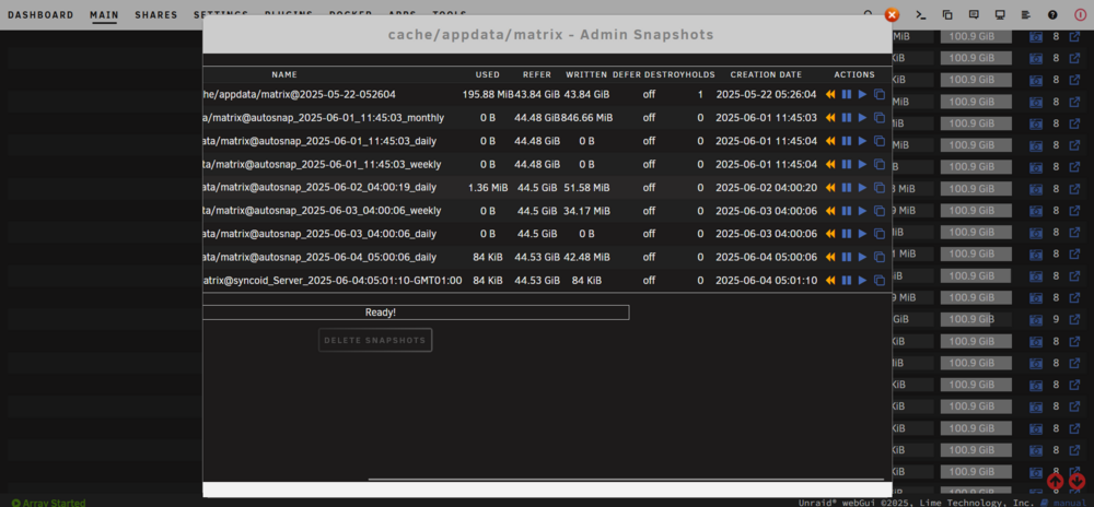
Here's some critical feedback for you. Not a knock whatsoever, just looking to give you some solid feedback and hopefully improve this for everyone, because you've got the foundations of something excellent already. :- ) If it were me, I would ditch all of the ACTIONS buttons littering the Main dashboard and speed up rendering by just attaching the functionality to clicking the left dataset icon (we don't have ACTIONS buttons per-disk in Main, but we do have clickable disk icons (which arguably should have shortcuts in, like how clicking the icons in Docker works). Furthermore, this would mean you would need to hyperlink the + and - symbols that are overlaid on top of the dataset icon that indicates expand and collapse for each dataset. Every day I repeatedly click the + or - icon confusedly, eventually refreshing the whole admin UI and eventually remembering that you click the dataset icon and not the + or -. I would say that it's because you can't teach this old dog new tricks, but that implementation doesn't follow any UI standard practices that I've seen. When ZFS Master updates every x frequency and all the icons blink from blue to grey to blue again. I wish that there was an additional dataset icon colour that followed Unraid's design language for defining unprotected and protected shares in the array. E.g., what happens when data is no longer protected by parity and the text colour of a share changes to orange (as I recall; which makes no sense anyway, IMO, because the brand colour shouldn't be associated with something negative, but that's a conversation for other people elsewhere lol!). I say this because it's one thing to have snapshots, it's a wholly other thing to have the data and snapshots replicated to another disk, and would be amazing to be able to see at a glance what actually has a replicated dataset and what doesn't, because right now they're all blue, even targets for replication! Managing all my datasets is very cumbersome. A toggle for the quantity calculation of snapshots would be nice. Seeing it recount a x frequency in row-by-row is fairly distracing if it's running on a secondary monitor out of the corner of my eye for hours on end whilst babysitting transfers and rebuilds. If the dataset icon itself goes blue when there are snapshots for it, then do I really even need the SNAPSHOTS column if I don't even want to see snapshot quantities? Seems a little redundant. I'd be quite happy to have the quantity of snapshots live inside the hover info for the dataset icon alongside CREATION DATE et al. Seems like the best place for it, IMO, especially considering that's where SPACE USED BY SNAPS lives as a piece of info, which makes more sense to see on lines on top of each other rather than scanning my eyes back-and-forth across a row, which is hard as there's so many numbers and capacity bars on the way to that number. I'm using the Sanoid plugin and a fork of the SpaceInvaderOne .sh User Script for scheduling snapshotting and replications, which is very messy, so would be nice to wrap that up into the ZFS Master GUI to just add the required vars from text fields per schedule/plan. I wish there was a destroy operation available via the GUI, but obviously it would need a confirmation dialogue. Komodo Core implements this well when destroying Docker containers as it makes you type out the name of the container into a modal pop-up and click Destroy again. You can also left-click the container name in the modal dialogue and then CTRL + V the name into the field if you're feeling lazy. Needing to use destroy via the CLI is quite dangerous as when you type the path of your dataset in, the / and Return keys are extremely close together, and having replicated snapshots has saved my arse twice now as there's no confirmation dialogue for destroy operations when working with ZFS via the CLI (yikes!). Your Browse icons don't follow the design language for Main or Shares and are instead on the right when they should be on the left, just like the disks. Any info on REFER, USED, and FREE, should probably be the right-most columns to follow the design language of the disks above. Other thing I would love to see is the likes of the Fix Common Problems plugin able to tell me when a scheduled snapshot and/or replication hasn't successfully taken place since a var threshold of y. But that's probably a conversation for LimeTech, or perhaps between you and them (worth pursuing if you do implement snapshotting and replication scheduling in the GUI, IMO). Refresh Information and ZFS Master Settings should be on the same line as Toggle reads/writes display. Likewise, Last refresh at % should be justified to the right of the div with the Refresh Information directly next to it. I'd like the option to hide Last refresh at % and instead offer a toggle to have it appear when hovering the cursor over Refresh Information. The only time I personally want to see that info directly is when the refresh schedule is set to x but it hasn't successfully refreshed in y, in which case I might like it to appear and also send a notification if for any reason it fails to refresh, though I can't imagine that happening as it would likely indicate much larger issues with the system. :- ) Perhaps a toggle for HEALTH would be good too. I would greatly prefer the HEALTH icons themselves (the heart) next to the disk 'ball' icon. I'm no ZFS expert in terms of fail-states, but perhaps reducing clutter overall via a toggle would make sense. I personally don't need to see the HEALTH unless it's anything but 100% OK and working order ("THE POOL IS IN NORMAL WORKING ORDER"), ergo, I don't need the HEALTH text nor the heart, personally. A toggle to hide the MOUNT POINT column similar to the BASIC VIEW/ADVANCED VIEW toggle on Docker would be nice as I'm just not going to need that information 99% of the time, and it's just pointless calls to render pointless info that clutters up the UI for me when I don't need it. The Docker page has vertically collapsible/expandable VOLUME MAPPINGS, so I'm obviously not the only person who struggles with being presented with too much info when they don't need it. The Admin Snapshots pop-under seems to require horizontal scrolling to view the icons. Attached a screenshot. The Ready! seems a little redundant in the Admin Snapshots view, as does the status bar when nothing is happening, because the existing design language dictates the greyed-out buttons as not currently being actionable, and orange ones being actionable. As an aside, I cannot for the life of me figure out how you remove a hold on a snapshot via the ZFS Master GUI. I would have thought that the Hold icon would turn into a function to remove a hold (maybe 'locked padlock' and 'unlocked padlock' icons would be better than a 'pause' icon? Not sure if there's any convention for that in ZFS), but I'm still offered the Hold feature for a snapshot even when clicking it yields a Hold Result of Operation not permitted. I wish I could choose to have my pools appear in the same order as my disks, e.g., my disk pool appears after my cache pool as it's in alphabetical order, but it makes navigating it quite confusing as I'm used to scrolling to the bottom of Main to find my cache pool, and so I'd assume I'd scroll to the bottom of ZFS Master to find it there. Even more strangely, it means that my metadata pool appears after all the disks. :- ) Hugely confusing to me! Personally, I would remove the HIDE DATASETS / SHOW DATASETS and instead start treating each pool name as the toggle for expanding and collapsing, or perhaps if you've got plans for the pool names being hyperlinked, just change it out for the standard expand/collapse UI icons, like what you find on the Docker page for VOLUME MAPPINGS. Just be careful it doesn't confuse people with the SPIN UP % / SPIN DOWN % icons directly above it. It's all close to being quite a nice system overall! :- ) I know you may disagree with some of the above, and perhaps even feel some of it is out-of-scope, but I just wanted to share my enthusiasm for what you've done. Hope you find something useful in the above!
-
Are users able to organize their scripts into folders similar to folders for Docker containers via the FolderView2 plugin? I've got a lot of scripts, not all of which are given a schedule, but they're there for use when necessary. Sifting through them in alphabetical order rather than what I'm likely to want at any given moment makes the whole thing quite cumbersome to manage after a while. Even a config option to set a default view that allows filtering Schedule Disabled to the bottom in a separate/divided list, just like how the Main view separates out the array and pools. I also find the lack of alternating colors like in the Main page the Unraid admin GUI makes it extremely hard to parse at a glance. Versioning scripts via Git and being able to pull a Git repository of scripts in would be amazing. I've messed up scripts on a few occasions and lamented the inability to quickly revert back to a previous, diff, or be able to update the scripts from a repository without fiddling around in the GUI. Excellent plugin overall, but oodles of untapped potential. :- )
-
Just wanted to say that yes, this is as safe as running the commands manually. Ergo, I assume you would want to be sure that when you do replicate it, you've not already got another running instance going on, otherwise you might potentially end up replicating an incomplete running job, so perhaps off-set the cron schedule relative to how long you think it'll take to run, which is relative to the scale of your dataset and I/O throughput of drives and NIC.
-
OpenProject 16 requires PostgreSQL 16 now. This is the message being shown to users of OpenProject 16 that released a few hours ago: Starting with OpenProject 16.0, PostgreSQL 16 is required to use OpenProject. Your installation will remain functional with your current database, but anticipate incompatability in future releases.
-
Hi all, Two XFS-based drive failures on my dual-parity array, and I've got a functioning drive that's not quite full that I could move the contents of to other functioning drives in the array. Can I empty this drive out then switch file systems on it without invalidating parity and thus my ability to rebuild the two disabled disks/use the emulated drive contents? I ask as I've got entirely highly-compressible data in the `lost+found`/`lostfound` dirs on each disabled disk, and would make more sense to transfer it from the emulated disks onto the ZFS drive and take advantage of the compression. And am I OK to use Unbalance to move the files to other drives without invalidating parity and thus my ability to rebuild/use the emulated drive contents?