


CyberMew
Members
-
Joined
Everything posted by CyberMew
-
Updated fine until 5.12.72 and shortly after updating and open the dashboard it took down the network. Completely dead. Any ideas why? Do I need to update my USG firmware in order to use the later controller version? Why can a controller update take down a network oh my goodness... Update: turned off and on USG and now it’s blinking white light. The LAN port is still not lighted up, same as before the restart. Update 2: steady blue light now. Still no go.
-
I just got a Unifi Flex Mini and the quick start guide says controller v5.12.5 and newer is required in order to adopt it. I am currently on tag 5.10.26-ls32. Should I upgrade to latest of v5.10 (5.10.27-ls32) before moving to latest of v5.11 (5.11.50-ls40) and then latest of v5.12 (5.12.72-ls61), so on and so forth until v5.14 (5.14.23-ls76)? Update: just realised 5.10.27-ls32 is not a valid one, will try the next latest version.
-
I thought that it was “disposable” and it would be great if it was in “incognito” mode everytime for just playing around. I just didn’t want the config folder to be the default folder since it isn’t multi tenant(?). I will figure out if it’s possible to change the default save directory to a folder that I will map it to. At the very least that will indicate users not to touch anything outside of my sandbox folder. Thank you both for your inputs.
-
This is the default Save folder. Which is saved inside the config folder for the container data. Feels wrong to me, especially if the user can just navigate to upper folder easily (on a desktop). Is there a way to hide it? Change the default folder?
-
Is there a way not to expose to config folder?
-
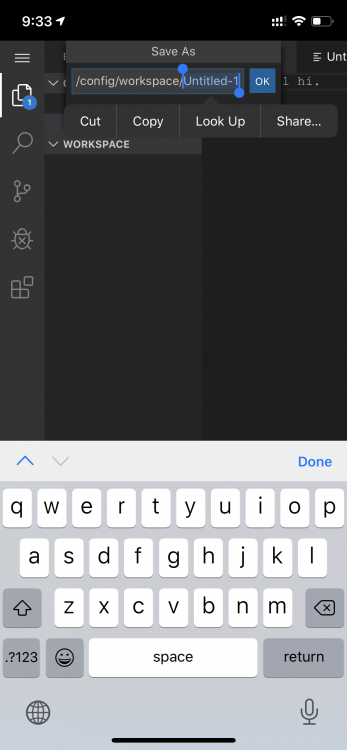
Do I have to add a new volume mapping? The default current save directory is loading /config/workspace/Untitled-1 which I don't think is correct..? The user can traverse upwards and expose the config folder...
-
How do we access and run the script?
-
Thanks. Does this mean that I have to manually add a volume to docker that map to my folder, in order to “see” external folder? Also, based on that article, does it mean I can share a specific folder in my Dropbox and finally allow other users to use my Dropbox account storage without having a business account?
-
I already have a 2tb folder on unraid that I want to share. How do I make that folder be shown in nextcloud? And even better yet like a normal folder so I can edit or move files around inside nextcloud?
-
I wanted some users to be able to access a specific share folder on my unraid, including download files and uploading files, even changing directory structure, within the confines of that share folder. Will this solve my problem? And is the installation guide on the first post dated 2017 still valid/updated?
-
Used this without issues, but now I'm getting the following errors after upgrading my account from pro to business teams trial. I am storing it directly in a disk (not user share)
-
Works great for me on 6.6.7 unraid, fixed my sonar and ombi and transmission spamming gigabytes of logs.
-
Is this docker image working for Dropbox again?
-
Thanks! Working fine, able to connect now! Now I just need to find out why my new nonadmin users don't have a cert (client cert revoked) and fix it.. edit: worked by itself after a while. all good
-
How do we connect to the docker from iOS OpenVPN Connect app? I selected Access Server and put in the details but it isnt working. Edit: needed to provide 9443 in port field. Edit 2: why is it connecting to my docker internal ip 172.17.x.x:1194?
-
Ah yes it's working now, I guess I tried it while it was still loading up. I just realise that it's limited for 2 connections? I remember it was totally free and open source?
-
Model: N/A M/B: Micro-Star International Co., Ltd. - X470 GAMING PRO CARBON (MS-7B78) CPU: AMD Ryzen 7 2700 Eight-Core @ 3200 HVM: Enabled IOMMU: Enabled Cache: 768 kB, 4096 kB, 16384 kB Memory: 32 GB (max. installable capacity 256 GB) Network: bond0: fault-tolerance (active-backup), mtu 1500 eth0: 1000 Mb/s, full duplex, mtu 1500 Kernel: Linux 4.18.20-unRAID x86_64 OpenSSL: 1.1.1a Uptime: 3 days, 01:52:06 After installing and clicking on Detect, it does nothing. Is this still working on v6.6.7 or on amd chips?
-
It’s been 3 months since I ran the docker and I’m getting warnings when accessing my own ip/sub domain now. How can I get it to update?
-
Seems to be propagation or cache issues, all is good now. Thanks!
-
Finally got mine to work, I had a previous 443 port forward rule pointing to another computer, no wonder connection was refused. However for some reason one of my subdomain cert is showing up as invalid, but no issues for the other 4 subdomains. Anyone has any idea why?
-
Also seems like the speed test repo has not been updated in 4 months. Is this plugin still usable?
-
I’m having issues loading the page. It just hangs there. And un-hangs after a long time. Is it because of past histories records?
-
Removed, restarted docker, same issue, very weird
-
Yes I'm going to that url (where domain is my own domain). Currently I'm trying this: server { listen 80; server_name _; rewrite ^ https://$host$request_uri? permanent; } server { listen 443 ssl; root /config/www; index index.html index.htm index.php; # Replace domain.com with my own domain server_name ombi.domain.com; # Removed just in case this is sensitive ssl_certificate LOCATION_REDACTED; ssl_certificate_key LOCATION_REDACTED; ssl_dhparam LOCATION_REDACTED; ssl_ciphers 'CIPHER_REDACTED'; ssl_prefer_server_ciphers on; add_header Strict-Transport-Security "max-age=31536000"; client_max_body_size 0; location / { auth_basic off; auth_basic_user_file /config/nginx/.htpasswd; include /config/nginx/proxy.conf; proxy_pass http://192.168.1.55:12345; } }
-
Ok I get now how it roughly works, however I'm still baffled as to why it isn't loading correct for me. It just "refused to connect". proxy_pass url is definitely correct. I even typed in the exact server_name ombi.domain.com. If anyone has any ideas on how to solve it I would appreciate it a lot!
