page3
Members
-
Joined
-
Last visited
Everything posted by page3
-
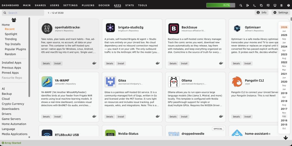
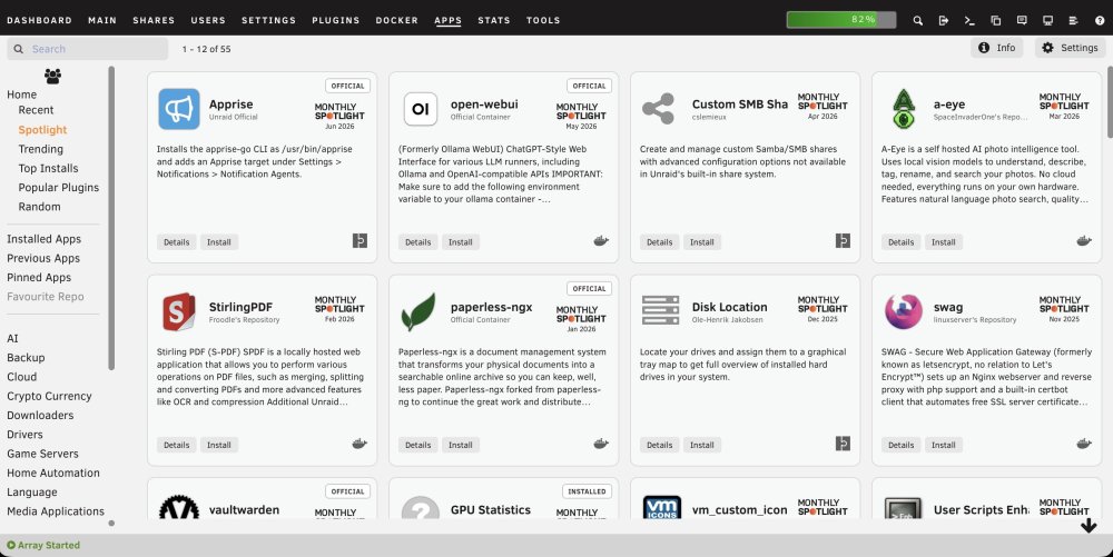
The recent Community Applications layout uses very large cards, which limits a desktop-width Apps page to three applications across and adds some visually strong hover and status styling. I put together the following CSS for the Custom WebUI CSS plugin. It provides four compact columns, contained descriptions, much smaller Spotlight branding, neutral status labels, a restrained hover state, and a translucent Recent-date navigator. Tested on Unraid 7.3.1 using the standard light and Black themes. As this targets Community Applications class names, a future CA update may require adjustments. Global CSS /* Community Applications: compact four-column card layout */ .ca_templatesDisplay { align-items: stretch !important; } .ca_holder.ca_appTemplate { position: relative !important; width: calc(25% - 14px) !important; min-width: 245px !important; max-width: none !important; height: 250px !important; min-height: 250px !important; margin: 7px !important; padding: 12px !important; box-sizing: border-box !important; overflow: hidden !important; display: grid !important; grid-template-columns: minmax(0, 1fr) 72px !important; grid-template-rows: 72px minmax(0, 1fr) 30px !important; grid-template-areas: "app spotlight" "description description" "buttons buttons" !important; column-gap: 10px !important; row-gap: 8px !important; } /* App icon, name and repository */ .ca_holder > .ca_appPopup.ca_backgroundClickable { grid-area: app !important; position: static !important; display: grid !important; grid-template-columns: 58px minmax(0, 1fr) !important; grid-template-rows: auto auto !important; column-gap: 10px !important; align-content: center !important; width: auto !important; min-width: 0 !important; height: auto !important; min-height: 0 !important; margin: 0 !important; padding: 0 !important; } .ca_holder .ca_iconArea { grid-column: 1 !important; grid-row: 1 / span 2 !important; position: static !important; width: 58px !important; height: 58px !important; margin: 0 !important; padding: 0 !important; display: flex !important; align-items: center !important; justify-content: center !important; } .ca_holder .ca_iconArea img, .ca_holder .ca_iconArea .displayIcon { position: static !important; width: 52px !important; height: 52px !important; max-width: 52px !important; max-height: 52px !important; object-fit: contain !important; font-size: 48px !important; } .ca_holder .ca_applicationName { grid-column: 2 !important; grid-row: 1 !important; position: static !important; align-self: end !important; min-width: 0 !important; max-width: 100% !important; margin: 0 0 2px 0 !important; padding: 0 !important; overflow: hidden !important; white-space: nowrap !important; text-overflow: ellipsis !important; font-size: 16px !important; line-height: 1.15 !important; font-weight: 600 !important; } .ca_holder .ca_author { grid-column: 2 !important; grid-row: 2 !important; position: static !important; align-self: start !important; min-width: 0 !important; margin: 0 !important; padding: 0 !important; overflow: hidden !important; white-space: nowrap !important; text-overflow: ellipsis !important; font-size: 10px !important; line-height: 1.2 !important; opacity: 0.7 !important; } /* Monthly Spotlight graphic */ .ca_holder > .homespotlightIconArea { grid-area: spotlight !important; position: static !important; width: 72px !important; height: 56px !important; margin: 5px 0 0 0 !important; padding: 0 !important; display: flex !important; flex-direction: column !important; align-items: center !important; justify-content: center !important; } .ca_holder .homespotlightIconArea > div:first-child { width: 64px !important; height: 22px !important; margin: 0 !important; padding: 0 !important; line-height: 0 !important; } .ca_holder svg.spotlightIcon { display: block !important; width: 64px !important; height: 22px !important; max-width: 64px !important; max-height: 22px !important; } .ca_holder .spotlightDate { margin: 3px 0 0 0 !important; padding: 0 !important; font-size: 9px !important; line-height: 11px !important; } /* Give Spotlight extra clearance only when a status pill is present */ .ca_holder > .cardFlagStack ~ .homespotlightIconArea { margin-top: 18px !important; } /* Description */ .ca_holder > .cardDescription { grid-area: description !important; position: static !important; width: auto !important; height: auto !important; min-height: 0 !important; margin: 0 !important; padding: 0 !important; overflow: hidden !important; } .ca_holder .cardDesc { position: static !important; margin: 0 !important; padding: 0 !important; font-size: 12px !important; line-height: 1.35 !important; font-weight: 400 !important; display: -webkit-box !important; -webkit-box-orient: vertical !important; -webkit-line-clamp: 5 !important; overflow: hidden !important; } /* Details, Install and status icons */ .ca_holder > .ca_bottomLine { grid-area: buttons !important; position: static !important; width: auto !important; height: 30px !important; min-height: 30px !important; margin: 0 !important; padding: 0 !important; display: flex !important; align-items: center !important; gap: 5px !important; } .ca_holder .caButton { position: static !important; margin: 0 !important; padding: 4px 9px !important; font-size: 11px !important; line-height: 1.2 !important; } .ca_holder .ca_bottomLine > span { position: static !important; } .ca_holder .ca_bottomLine > span:last-child { margin-left: auto !important; } /* Subtle status pills: official, installed, etc. */ .ca_holder > .cardFlagStack { position: absolute !important; top: 8px !important; right: 8px !important; z-index: 3 !important; } .cardFlagStack > div { min-width: 0 !important; height: auto !important; margin: 0 !important; padding: 0 !important; background: #fff !important; border: 1px solid rgba(60, 60, 60, 0.35) !important; border-radius: 4px !important; box-shadow: none !important; } .cardFlagStack .installedCardText { min-width: 0 !important; height: auto !important; padding: 4px 7px !important; background: transparent !important; color: #333 !important; text-shadow: none !important; font-size: 9px !important; font-weight: 600 !important; line-height: 1 !important; letter-spacing: 0.4px !important; } .LTOfficialCardBackground, .officialCardBackground, .installedCardBackground { background: #fff !important; border-color: rgba(60, 60, 60, 0.35) !important; } .installedCardBackground { border-style: solid !important; border-width: 1px !important; } /* Keep card hover extremely subtle */ .ca_holder.ca_appTemplate, .ca_holder.ca_appTemplate:hover, .ca_holder.ca_appTemplate:focus, .ca_holder.ca_appTemplate:focus-within { transform: none !important; filter: none !important; outline: none !important; box-shadow: none !important; transition: none !important; } .ca_holder.ca_appTemplate:hover { background-color: rgba(0, 0, 0, 0.015) !important; border-color: rgba(120, 120, 120, 0.16) !important; } .ca_holder:hover .ca_backgroundClickable, .ca_holder:hover .ca_bottomLine, .ca_holder:hover .ca_bottomLineSpotLight { filter: none !important; box-shadow: none !important; } /* Recent page date navigation */ #caAlphaBar { right: 10px !important; padding: 8px 7px !important; background: rgba(255, 255, 255, 0.82) !important; border: 1px solid rgba(80, 80, 80, 0.16) !important; border-radius: 8px !important; box-shadow: 0 2px 10px rgba(0, 0, 0, 0.08) !important; backdrop-filter: blur(5px) !important; -webkit-backdrop-filter: blur(5px) !important; } #caAlphaBar .caAlphaLetter { min-width: 34px !important; padding: 2px 5px !important; color: rgba(35, 35, 35, 0.76) !important; font-size: 11px !important; line-height: 1.15 !important; text-align: center !important; border-radius: 4px !important; } #caAlphaBar .caAlphaYear { color: rgba(25, 25, 25, 0.92) !important; font-size: 13px !important; font-weight: 600 !important; } #caAlphaBar .caAlphaLetter:hover { background: rgba(0, 0, 0, 0.05) !important; } #caAlphaBar .caAlphaActive { background: rgba(245, 110, 35, 0.10) !important; color: #d95f20 !important; } /* Responsive fallbacks */ @media (max-width: 1250px) { .ca_holder.ca_appTemplate { width: calc(33.333% - 14px) !important; } } @media (max-width: 900px) { .ca_holder.ca_appTemplate { width: calc(50% - 14px) !important; } } @media (max-width: 620px) { .ca_holder.ca_appTemplate { width: calc(100% - 14px) !important; min-width: 0 !important; } }Additional CSS for black theme: /* Status pills for Black Theme */ .cardFlagStack > div, .LTOfficialCardBackground, .officialCardBackground, .installedCardBackground { background: #f4f4f4 !important; border-color: rgba(255, 255, 255, 0.35) !important; } .cardFlagStack .installedCardText { color: #222 !important; } /* Recent page date navigation: Black Theme */ #caAlphaBar { background: rgba(32, 32, 32, 0.84) !important; border-color: rgba(255, 255, 255, 0.12) !important; box-shadow: 0 2px 10px rgba(0, 0, 0, 0.28) !important; } #caAlphaBar .caAlphaLetter { color: rgba(255, 255, 255, 0.72) !important; } #caAlphaBar .caAlphaYear { color: rgba(255, 255, 255, 0.92) !important; } #caAlphaBar .caAlphaLetter:hover { background: rgba(255, 255, 255, 0.07) !important; } #caAlphaBar .caAlphaActive { background: rgba(245, 110, 35, 0.18) !important; color: #ff8b4f !important; }
-
Thank you. I will look in to this. I run Immich and postgres is the support Db. I believe it's a big of a resource hog.
-
Advice is to reboot, after posting diagnostics (below). Any assistance most welcome. I’m not seeing any obvious consequences. tower-diagnostics-20240901-0909.zip
-
Oh and I reinstalled the “docker upgrade patch” which got removed during the update.
-
I used this guide but make a note of your dockers first because the template list had everything I’d ever tried.
-
I also rolled back and got exactly this error with my dockers. In my case I fixed it by following the instructions to remove the dockers and re-added them to rebuild the containers. All is now working smoothly again.
-
After upgrading to 6.12 I also started getting these issues, plus the gui becoming unavailable. Then the server crashing - first time in 9 years. Switched to ipvlan which made the server less responsive and started causing network issues. Tried moving dockers to a second network card, but issues persisted. Rolled back to 6.11.5 and all is good again. I’ll wait a while before thinking of upgrading again.
-
That worked great, thank you.
-
This is now showing up as “not available” in my docker containers list, so can’t be updated. Is there anything I need do to fix this?
-
Great to see a replacement for the old docker version, thanks. Weird issue though. Since the recent update if I view using safari (iPad) the interface doesn’t render. The url bar flickers continuously. Seems to work fine on other devices, and the previous version worked fine on the iPad. Any ideas?
-
The Curl command worked! Thank you many times over.
-
Can anyone give any advice on how to get Claim to work, following a password reset as per Plex’s instructions earlier today from the resultant data breech? Password reset. New Claim code obtained and pasted in to docker config. Restart. Navigate to local Plex and log in, but no option to Claim server.
-
Hi Josh. I do appreciate you taking the time, however unfortunately this isn’t the issue. No matter how many times I correct my configuration and remove the unwanted folders, they come back at next restart. I know it’s basic stuff, I know it should work. It just isn’t though. Oh well. It’s working great as configured. It’s clearly nothing to do with your App or template.
-
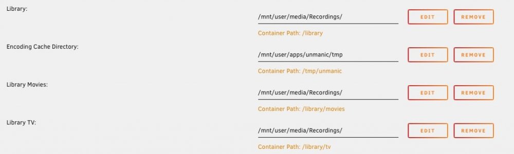
Both 'tv' and 'movies' have come back yet again! This time instead of deleting them I've mapped both to the same folder that I actually want. I only want 'Library' and have no idea where "Movies' and 'TV' keep coming from, no matter how many times I delete them.
-
Hi. Both folders came back again. This time I blanked the content as you suggest followed by save and then I removed them, rather than just 'remove' from the template page. I've also check the config in /boot/config/plugins/dockerMan/templates-user and they do appear to be gone, so we'll see if they stay gone. Thanks.
-
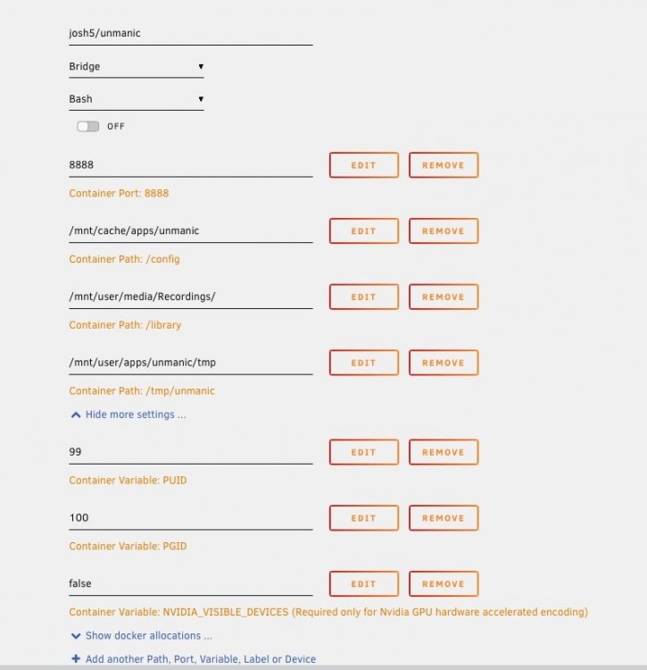
I currently have this, which is working great. Whenever the docker updates it appears to add two further library paths - one for tv and one for movies. Neither of which I need so I just delete them. They do seem to keep coming back though. I could be missing something obvious!
-
Earlier versions had a mapping to library within the docker template. Recent versions seem to have added a tv and movies mapping, which I need to keep deleting as they keep coming back. By default they map to places I don’t have (or want) which keeps creating them on my drive. Is this a bug or an intended feature?
-
Great app which I’m finding really useful. I even managed to follow the video and migrate without issue. However (why is there always a however!) I’m not finding the “support future development “ at all intuitive. It just takes me to something called “patreon” but doesn’t explain what I’m supposed to do there, how I contribute or what financial options are available. Perhaps some explanation or a simple cookie jar for simpletons like me would work?
-
A real shame. Recordings Converter was excellent and has been running without issues for months and months. I guess I’ll have to look at Unmanic again, but RC was just so simple and just worked.
-
Hi all, I have syncthing installed and working, but do have a couple of "best practice" questions. Not specifically Linuxserver related, but definitely Unraid related! I am syncing a large photo directory between Mac and Unraid. Does anyone have any suggested (recommended) settings for: 1. Full rescan interval 2. Watch for changes I assume (2) should be on for both Mac and Unraid. I presume setting (1) to something bigger like 24 hours would be suitable for Unraid so as not to keep spinning up drives. I've searched but not found anything specifically Unraid related.
-
Thanks for the suggestions. I went through the list but still no dice I'm afraid. Unfortunately I really don't want to use bridge mode. It has caused problems with the UniFi USG router in the past and since segregating internet connection and routing the set-up has been working flawlessly. Additionally my modem/router has to hold open a VPN to tunnel through CGNAT and provide a fixed IP address. Here in the UK our fixed internet is so poor I finally gave up and now use 4G exclusively, crazy as I'm only 25 miles outside the M25. Look like I need to have yet another go, starting from scratch. It really should work.
-
Anyone able to shed any light or offer any suggestions on my connectivity issue?
-
Same problem, but iOS client. The handshake just keeps on retrying. I have a UniFi USG with port forwarded as suggested in the blog. I do however have an upstream router (used as modem only) with its DMZ set to the UniFi USG. Any help appreciated Local server configuration [Interface] #Unraid VPN PrivateKey=***= Address=10.253.0.1 ListenPort=51820 PostUp=logger -t wireguard 'Tunnel WireGuard-wg0 started' PostUp=iptables -t nat -A POSTROUTING -s 10.253.0.0/24 -o br0 -j MASQUERADE PostDown=logger -t wireguard 'Tunnel WireGuard-wg0 stopped' PostDown=iptables -t nat -D POSTROUTING -s 10.253.0.0/24 -o br0 -j MASQUERADE [Peer] #Remote PublicKey=****= PresharedKey=****= AllowedIPs=10.253.0.2 Remote peer configuration [Interface] #Remote PrivateKey=***= Address=10.253.0.2/32 DNS=192.168.0.1 [Peer] #Unraid VPN PresharedKey=***= PublicKey=***= Endpoint=*.*.*.*:51820 AllowedIPs=10.253.0.1/32, 192.168.0.0/24
-
Can I just say “thank you” for such a useful application. I’ve been having terrible problems with my home broadband (aka it’s been down 5 weeks!) and is flaky when it worked. I’ve therefore been trying a 4G router (and vpn to get around CGNAT) and your app has been crucial in determining if this was a valid solution. BTW as a Zend Framework/PHP/JavaScript/JQuery developer I’m intrigued by Laravel/React so your app looks an interesting one to peek at
-
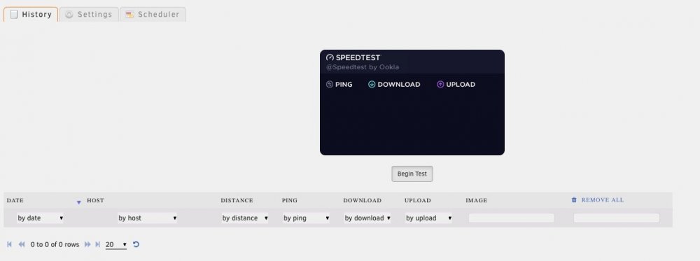
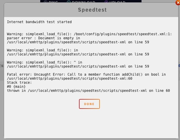
Hi all. This plug has been working great for years, but I see today the results have all vanished and when I try to run a test I get an error. Screen-shots attached. I have tried removing and re-installing the plugin. Anyone know what this might be?